 |||
|||
Why is VS Code so much harder to theme than Atom? There were so many experimental themes for Atom and in Code it’s like… different color menu bar. Whoopee.
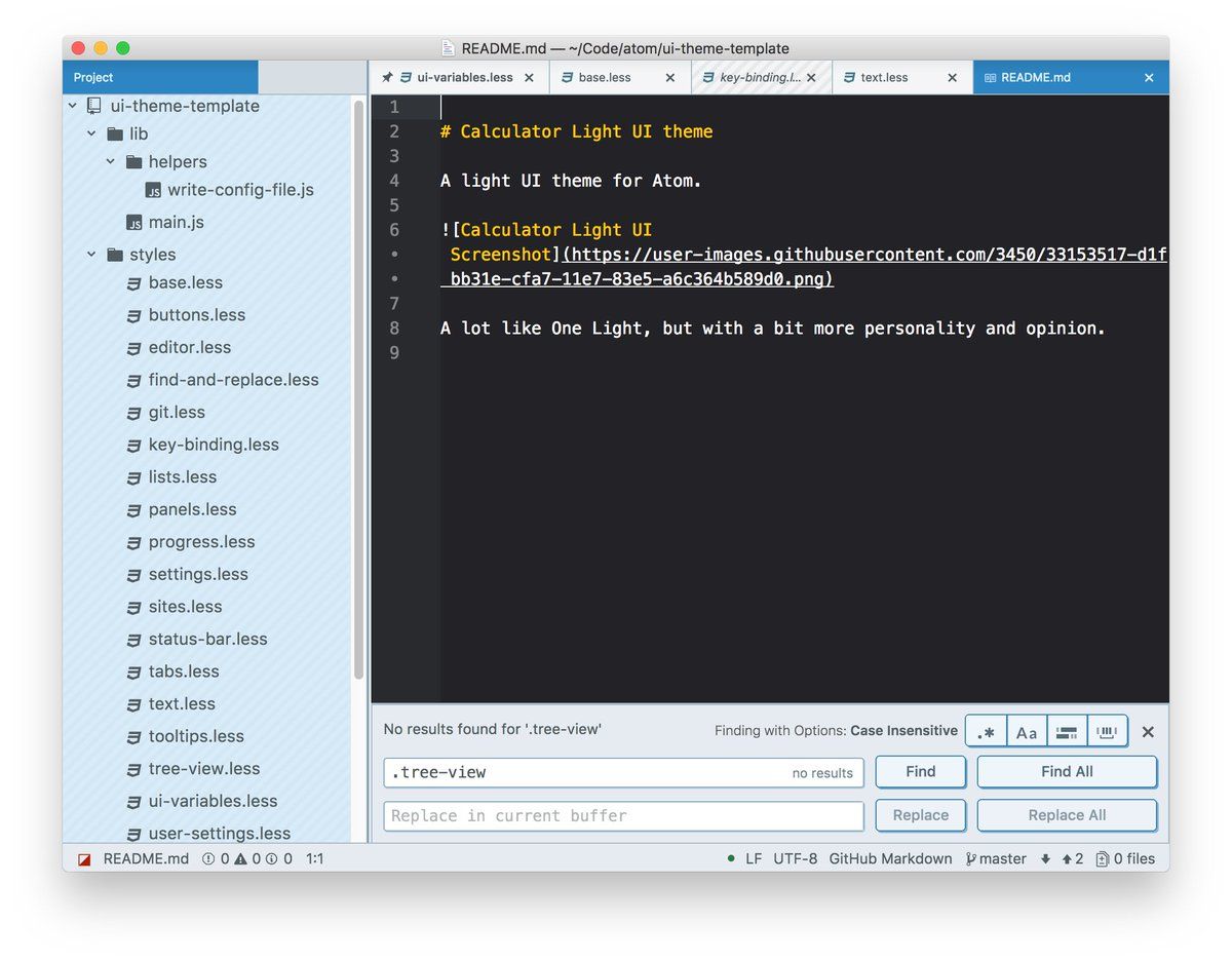
I didn’t use all of the really goofy ones but it was fun that you could at least try. I really liked “slightly 3D” skeuomorphic interfaces, like Calculator UI.
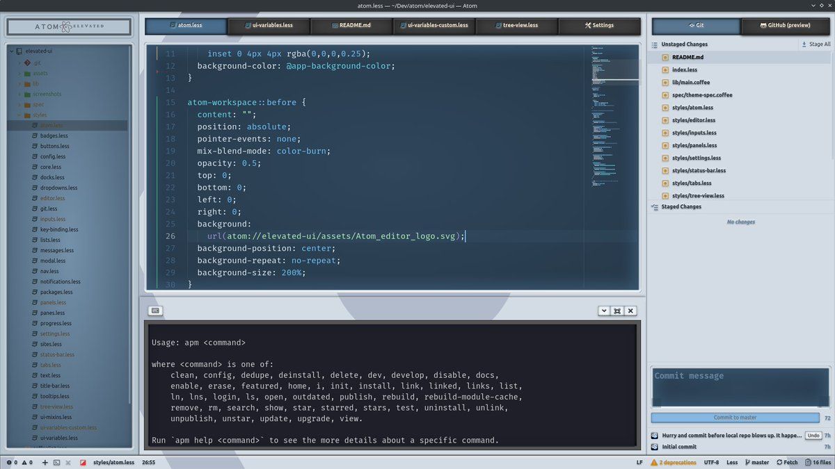
Elevated UI had this too, in a more “realistic” fashion.
Atom 1 tried to replicate the original Atom advertisement which I think is adorable.
BTW if you haven’t seen that ad, you should - it’s an amazing piece of marketing and tech history as well:
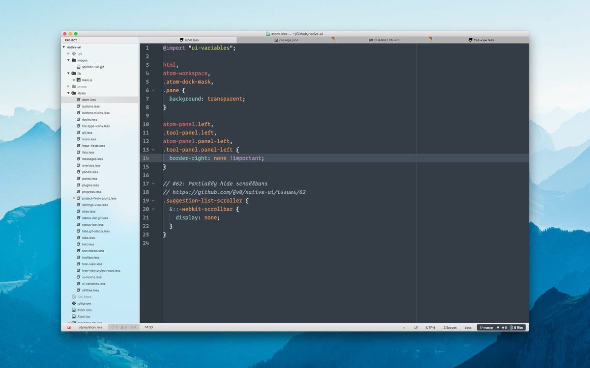
There was a theme that mimicked the Mac native look, too.
Pure-UI: super minimal, but with subtle (and customizable) background images.
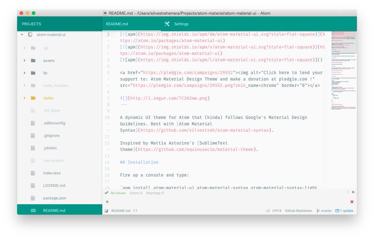
Material-UI, with customizable accent color.
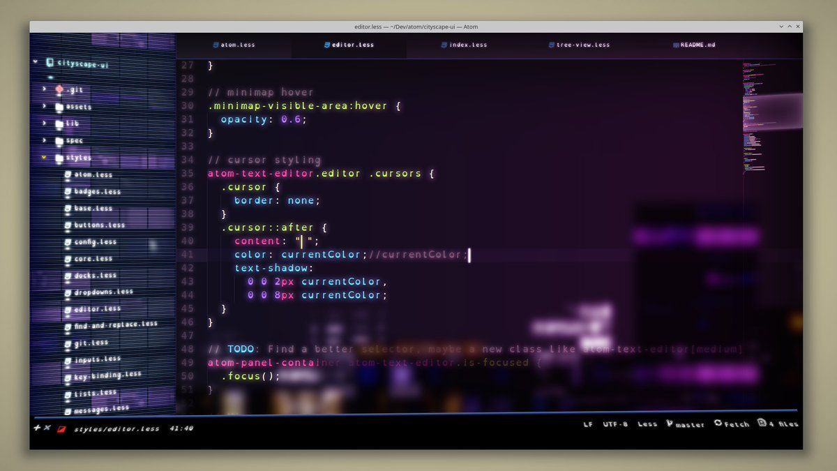
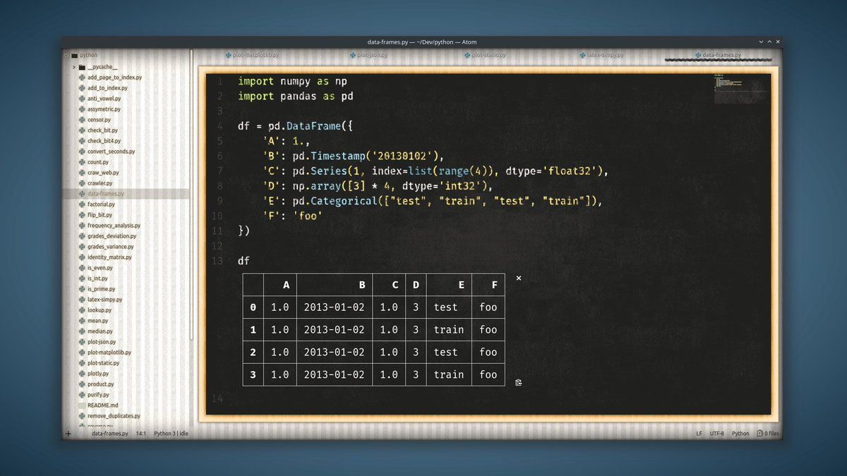
A lot of the crazier themes were created with the explicit purpose of Using Up Your Compute, like this cyberpunk city theme, with glass blur effect and the filesystem angled to map to the distant buildings.
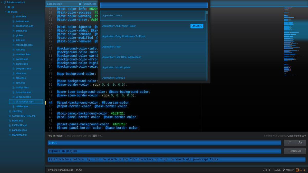
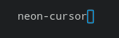
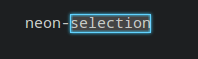
Or this Futurism UI, with neon cursor and selection!
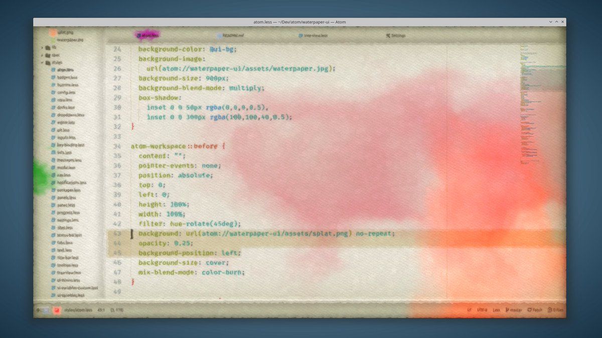
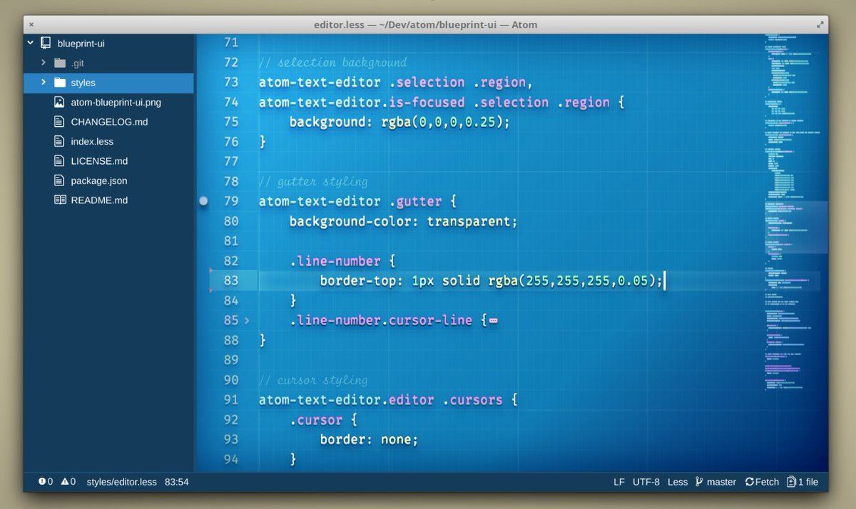
Chalkboard, blueprint, notebook, watercolor:
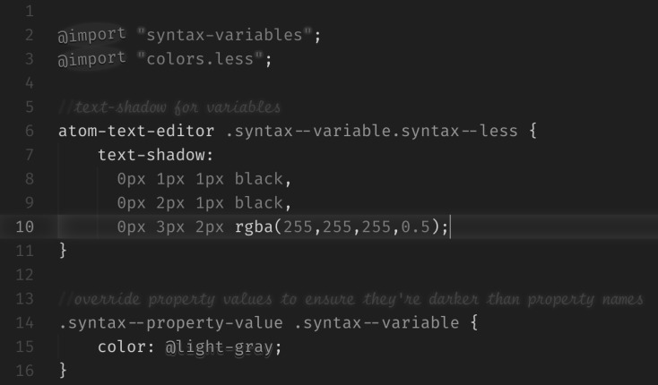
People were also doing interesting things with syntax highlighting. Like the “monotony” theme, which uses no colors but different font effects to highlight syntax.
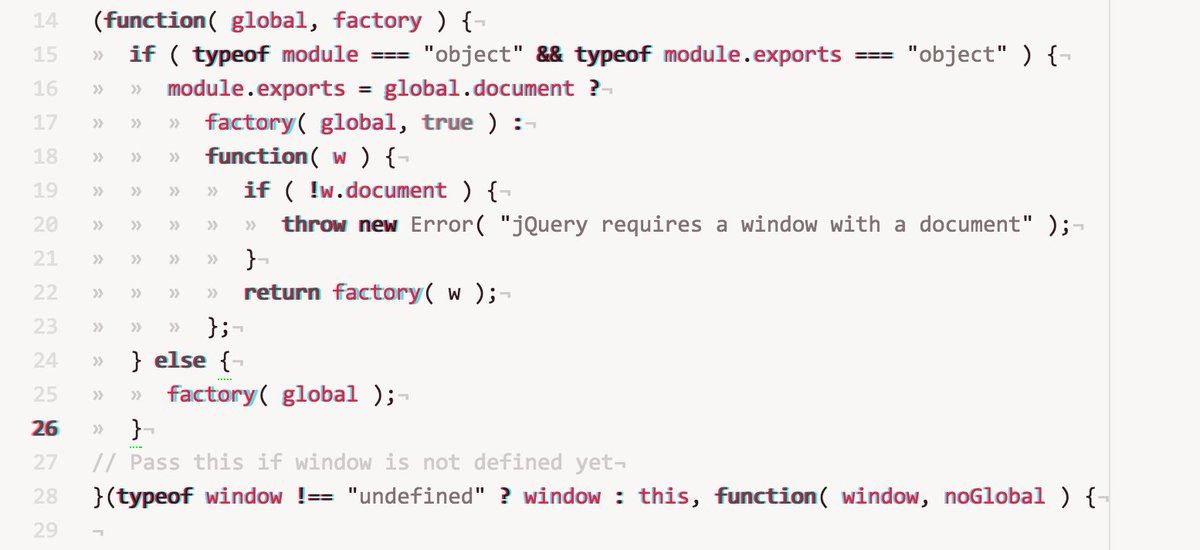
Or the anaglyph theme, which I used for way too long tbh:
ironically i used to use an anaglyph syntax theme lol. i never really used 3d glasses on it that much, just got used to the look of different depths meaning different things. it was for Atom though so it's long gone now ig
— web weaver (@deepfates) April 1, 2022
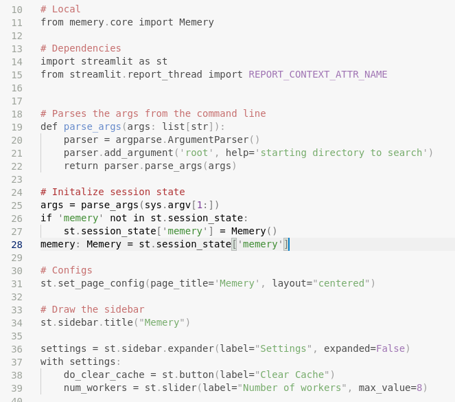
Of course, these days I prefer a super-minimal syntax theme that maintains consistency and helps me focus on the shape and meaning of the code. Plus it makes comments MORE visible, rather than less, which makes so much more sense!
I miss other things about Atom more though, like some of the crazier plugins:
VSCode is pretty cool but there's a lot of cool shit i miss from Atom. like scrolling sideways through time 🥺 pic.twitter.com/hoCFonIGZu
— web weaver (@deepfates) May 2, 2022